How good do you have to be at drawing before you start working on your first comic? What if you’re not talented enough? And how do you make the most of whatever talent you have? These are some of the questions I try to answer in this episode.
drawing
Going off the grid
The grid. Is it keeping the artist from expressing himself or are guidelines helpful? Let’s talk about the pros and cons!
First let’s talk about what a “grid” is: The grid is the arrangement of panels on the page in a predictable and similar manner. For instance, sticking to three rows of panels per page or even having the same number of panels, like the popular 9-panel grid.
While you don’t have to follow the exact same grid on every page, it’s certainly helpful to have some sort of guidelines – especially if you want to experiment on some pages! Tilted panels, A panel with no frame or a double-page spread has little effect if ALL of the comic is experimental.
The upsides to following a grid are many. The hard part of the storytelling is already done for you, the reading order is obvious. But as long as readers can find their way from one panel to the next in the right order, there is lots of room for experimenting with the page layouts in comics. Just remember, characters and objects sticking out of panels, borderless panels or big, fancy page layouts can be a lot more challenging to read, let alone create!
Even if you have an overall grid you use for a particular project, breaking it up can be a good idea. Keep those readers awake! The use of larger panels for emphasis can be a good variation. Just be aware, that larger panels tend to slow things down and smaller panels give off a more hectic feel. You can also experiment with panels that bleed all the way to the edge of the page or perhaps a figure in a panel with no frame. Variation in size and borders can be done without deviating too far from the underlying grid – but it should always be rooted in the story, in what you are trying to get across.
You may feel like you should be coming up with new and exciting ways to tell your story, but deviating to far away from the grid requires a mastery of the craft and may in fact hurt the storytelling. If people have to stop and think about reading order or what is going on, you’re not doing your story any favors.
If you’re unsure of wether the page reads right, try drawing the balloons and panels on a seperate sheet, see if the reading order makes sense without any pictures. Sometimes you can fix any problems just by moving a balloon to the top or bottom of a panel, to make the reading order perfectly clear. No need to redraw the entire page because of it!
My advice: Experiment within the grid and steer clear of wild panel arrangements until you know how to tell a story in a simple layout. Have faith in your story and focus on telling that story. Don’t try to impress readers with flashy, cool page layouts if it makes for a confusing read. Communication is key.
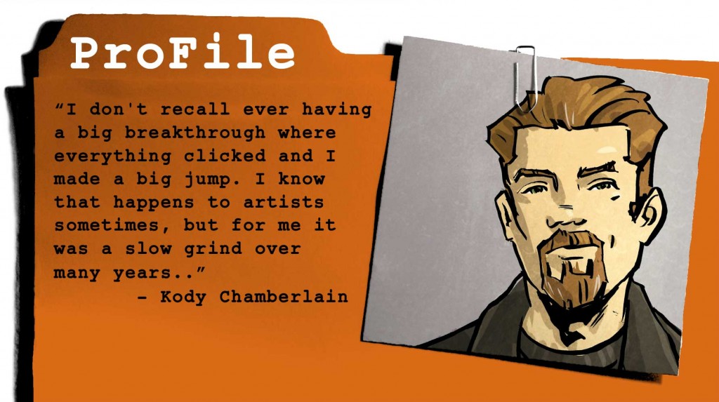
ProFile: Kody Chamberlain
Kody Chamberlain spends most of his time creating comic books and graphic novels, but also works in film, animation, video games, and television. Credits include DC Comics, HarperCollins, IDW Publishing, Image Comics, LucasArts, Marvel Comics, MTV, MTV Comics, Mulholland Books, Sony Pictures, 12 Gauge Comics, Universal Pictures, and Warner Bros. In addition to his work in entertainment, Kody also an inspirational keynote speaker and consultant on the subject of creativity. Credits include CTN Animation Expo, HOW Design Live, INNOV8, Modbook, Macworld, iFest, Wizard World Comic Con, as well as AdFed groups and major universities throughout the United States.
You can find out more about Kody at his website: http://kodychamberlain.com.
His latest book SWEETS: A New Orleans Crime Story:
Print edition: http://tinyurl.com/amazonsweets
Digital edition: http://tinyurl.com/digitalsweets
As high school was wrapping up, I had no plan on what to do next. I was interested in a few different things but no real goals so I decided to go to college and figure it out along the way. I thought I might try engineering because I was doing very well in math so I signed up for an advanced math class that was part of the engineering program. I also signed up for a lot of the usual classes you have to take early in college including basic art classes. I was already doodling a bit here and there, so I thought the drawing classes would be fun.
I quickly realized that I hated the math class, and really enjoyed the drawing class. It was a dilemma because I was good at math and bad at drawing. I discovered graphic design somewhere along the way, thinking it might be a nice combination of the two and I picked it as my focus. After a few months in, I started hanging around with a few guys that were serious about comics and that’s what got me hooked.
I was also writing a bit, and thought it’d be fun to try getting into comics. I sucked for a lot of years but I was making slight improvements here and there, and slowly, things got better. I don’t recall ever having a big breakthrough where everything clicked and I made a big jump. I know that happens to artists sometimes, but for me it was a slow grind over many years. I was having a lot of fun and I knew if I kept pushing forward I’d eventually get to a professional level, so I stuck with it.
I started drawing around 1990 or 1991 and started sending out submissions around 1994. In 2002 and 2003 I started to get favorable replies from publishers and editors and I got my first paid work in 2004. Basically, it took me about 15 years of practice to get paid work.
What part of the process is the most challenging or frustrating to you?
The toughest part for me is letting go. I have to constantly remind myself to stop and move on to the next thing. I’ve talked with enough people to know that it’s a very common problem, and I think it’s one of the main reasons many aspiring creators never actually become professionals. I know plenty of people that have been talking about a project for years and claim to have something done on it, but I have yet to actually see anything from it. They’re stuck in the “loop” of reworking material and they never get out. I’m able to work past it, but I’m always a little grumpy when I have to let something go. In reality, if I were to keep reworking it I know I would kill it. Letting go is a daily struggle, but after an issue of a comic hits the shelf, I always feel good about the work. A little distance solves most problems.
If you could give one piece of advice to an aspiring comics creator, what would that be?
Stop sending out scripts, drawing sample pages, and mailing out submissions. Make a comic. You don’t need a team or a publisher, just make it. Write it, create some artwork, letter it, and then put it out. Then do it again. Even if you don’t end up doing every job when you get into the industry, you’ll have a detailed understanding of the process, and that’s an asset. You don’t need permission from anyone to make a comic, and you don’t need much money. The cost of making comics versus film, animation, etc is incredibly low. Once you’ve made a comic you are now a comic book creator, not an aspiring comic creator. You’ll find the industry treats you differently.
Art tutorial: 5 hacks for drawing backgrounds quicker
Do you have to draw backgrounds on every panel? The short answer is no. If you start with a good establishing shot and learn these 5 hacks, you can get away with very little background drawing!
1: Structure
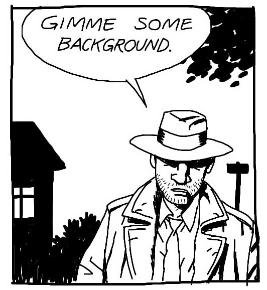
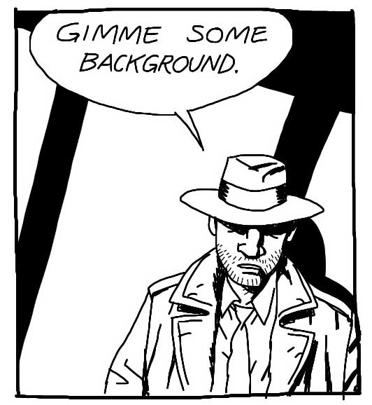
If you place your characters against a wall or another big surface (like the sky!), a few rightly placed lines will give the illusion that we’re still in the place you showed us in the establishing shot (usually a wide shot in the first frame to establish the room or setting we are in, who is present, where the door is, stuff like that).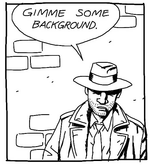
2: Silhouette
The outline of whatever is behind your characters can be quite enough – and a LOT quicker to draw! So if the scene takes place in a living room, just black out the shape of the lamp and a couch, if it takes place in the woods, black out tree trunks and leaves.
Pro tip: If you let elements poke in from the sides it lets us know there is more outside the frame. It’s a cheap trick but it works every time! Hint or show part of an object or shape and our minds will fill out the rest.
3: Shadow
Some shadows – from a window, a tree or other objects nearby – is a great way of showing us what is outside the frame while avoiding to draw it all together. Don’t try to think realistically of where the light would be coming from or how the perspective would look, just treat it as a nice shape to liven up your drawing.
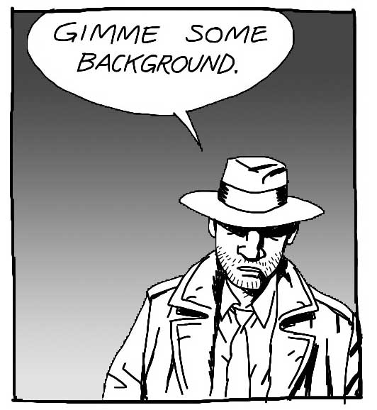
4: Gradient
A color gradient – or in this case just a grayscale one – can sometimes make it out for an actual background. It’s perhaps not the most sophisticated solution, but it makes the character “pop” and that’s often all you need.
5: Riff
A “riff” is a graphic shortcut. Every artist has her own. Sometimes a riff is just some shapes/lines, not a realistic rendering of anything. Make your own riff or copy from another artist whose style resembles yours. I think I lifted this one from Mike Mignola, a brilliant background artist to steal from – because he rarely draws much and has a superb sense of graphic storytelling.
Again, you need some background, at least in one or two frames per page, so the readers know where the characters are. But once you’ve established the world around your characters, it’s OK to cheat a little on the rest of the page. And now you know how!
—
If you want to know more about background drawing and perspective, check out this episode of the Comics for Beginners course.
ProFile: Aaron Alexovich
AARON ALEXOVICH’S first professional art job was drawing deformed children on Nickelodeon’s Invader Zim. Since then he’s been deforming children for various animation and comic projects, including Avatar: The Last Airbender, SLG’s Haunted Mansion, DC’s Fables, Kimmie66, Confessions of a Blabbermouth, and three volumes of his own horror/comedy witch series, Serenity Rose. Aaron currently lives in Southern California, where the bright light makes him sneeze
for mysterious reasons.
What made you decide to work in the medium of comics?
There’s something incredibly personal about making comics, you know? It’s just you sitting there alone building a whole world up on a page. Almost like making an entire feature film single-handedly. Not every art form can compete with that kind of control. I love it. Kind of feels like dreaming when I’m really into it.
What part of the process is the most challenging or frustrating to you?
Every part feels frustrating most of the time. I sort of live for those little moments when things seem to come together. If I had to pick one especially tough part I’d have to choose inking. Still trying to find a way to ink stuff without killing all the energy in my roughs…
If you could give one piece of advice to an aspiring comics creator, what would that be?
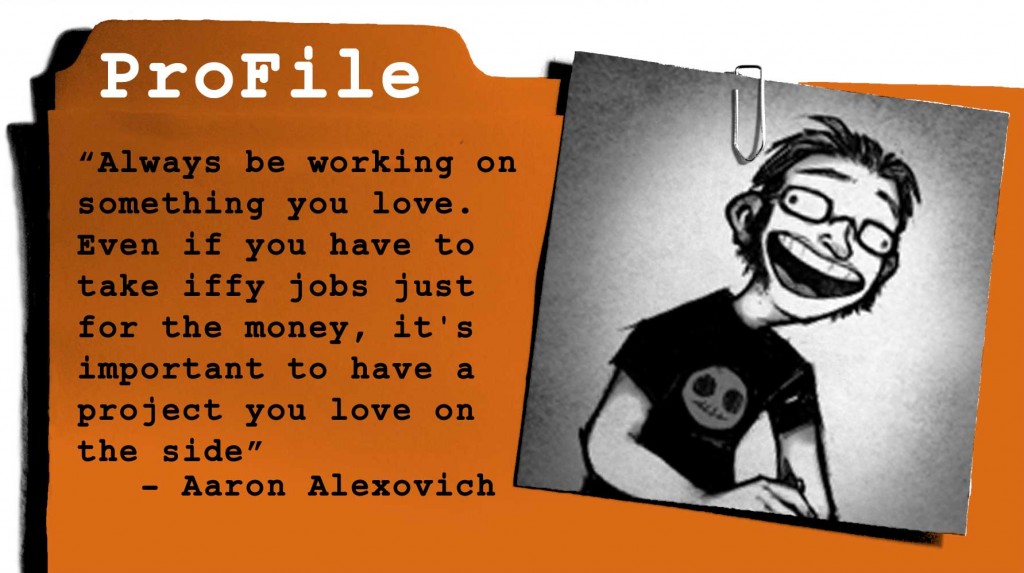
Always be working on something you love. Even if you have to take iffy jobs just for the money, it’s important to have a project you love on the side. Otherwise you’ll forget why you got into comics in the first place!
Aaron Alexovich’s site is heartshapedskull.com
Seth Kushner and Nathan Schreiber – Comics for Beginners podcast episode 18
Seth Kushner (http://www.sethkushner.com/) is a photographer and writer, known for his awesome portraits in Leaping Tall Buildings: The Origins of American Comics and his Schmuck series and photocomics on Trip City. Nathan Schreiber (http://www.nathanschreiber.com/) is an Eisner and Harvey Awards nominated artist, whose own book Power Out won a Xeric award in 2009.
I talked to both Seth and Nathan about the art and craft while I was in New York this fall, only later realizing what a great double feature the two interviews would make, as they worked together on Seth Kushners Schmuck! Their collaboration on the Schmuck series can be found at http://welcometotripcity.com/2013/10/schmuck-14-size-11/
