• Skip to main content
  • Skip to secondary navigation
  • Skip to primary sidebar
  • Skip to footer

Comics for Beginners

How to Write & Draw Comics

  • Contact
  • About
  • Faqs
  • Log In
  • Resources
  • Podcasts
  • Comics Crash Course
  • Blog
  • Videos

panel layout

Can Comics Composition Be Taught?

by Palle Schmidt 7 Comments

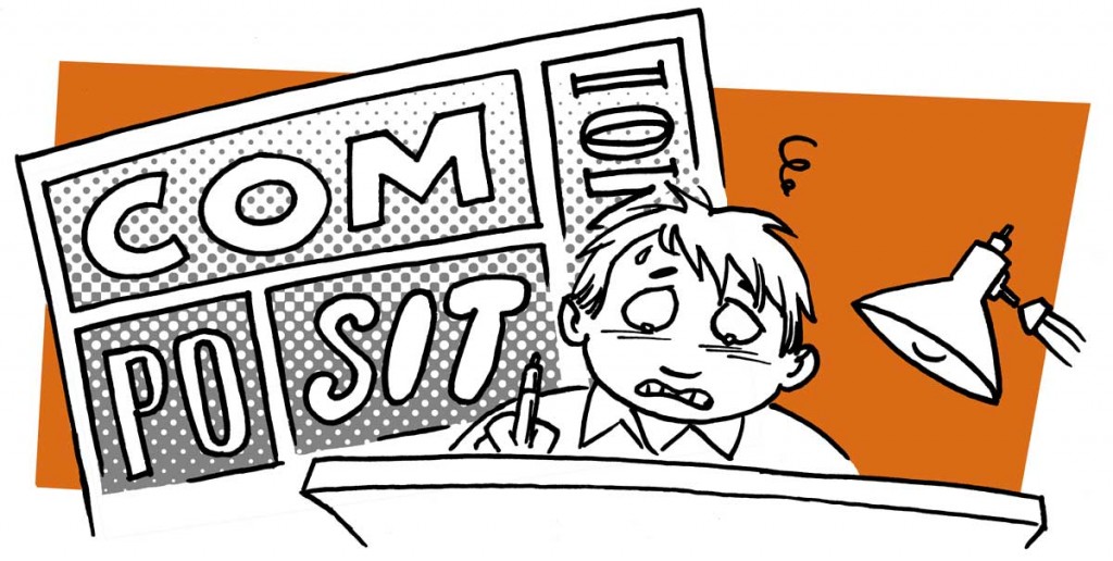
compositionIn any comic, the way the panels arranged on the page is extremely important. Equally important, is what’s inside the panels!

Every panel has it’s own composition. And the arranged panels make up the composition of the page.

It is almost impossible to teach composition. In comics, it’s basically the distribution of black (or dark) shapes on a white page. A good composition is pleasing to the eye and helps guide the reader’s attention. The main focus should be telling the story.

The best advice I can give on composition, is work really hard on your thumbnails. If it works in a two-three inch sketch, it will probably work in full size as well. Ask yourself if it’s clear what’s going on. Is the eye guided down the page? Is it pleasing to look at? Does the page “tip” because there is too much or too little black in some areas?

Another pitfall to avoid is vertical or horizontal lines within the frames, like a wall or a door. If the line art i.e. the thickness of the lines are similar, the eye can easily confuse it with the edge of the panel. If you make sure to break the lines within the panels with an object, a person or a speech ballon, and that will help the reader tell the lines apart.

Take photocopies of your thumbnails, and try going over them with a black marker, trying out different ways to apply shades and blocks of light, to make the page appealing. Remember that speech baloons are part of the picture! And if you intend to color the page that matters as well.

When you are working on the actual page, try tacking it to your wall and taking a few steps back. Quite a few steps, actually! If a panel or page works at a ten feet distance, you’ve done a good job.

If you’re working digitally, be sure to zoom out once in a while for the same effect. Or print it out and doodle on the printout to see what might help adjust the overall expression.

In summary: The more decisions you make at the thumbnail stage, the less trouble you will have with composition at the final inking stage.

—

Find tips like these helpful? Be sure to sign up for the newsletter
Filed Under: Pro Tips Tagged With: artwork, comic book layout, composition, drawing, drawing tips, how to, light and dark, making comics, page layout, panel layout, shading, thumbnails

Going off the grid

by Palle Schmidt Leave a Comment

20140218-151818.jpg

The grid. Is it keeping the artist from expressing himself or are guidelines helpful? Let’s talk about the pros and cons!

First let’s talk about what a “grid” is: The grid is the arrangement of panels on the page in a predictable and similar manner. For instance, sticking to three rows of panels per page or even having the same number of panels, like the popular 9-panel grid.

While you don’t have to follow the exact same grid on every page, it’s certainly helpful to have some sort of guidelines – especially if you want to experiment on some pages! Tilted panels, A panel with no frame or a double-page spread has little effect if ALL of the comic is experimental.

The upsides to following a grid are many. The hard part of the storytelling is already done for you, the reading order is obvious. But as long as readers can find their way from one panel to the next in the right order, there is lots of room for experimenting with the page layouts in comics. Just remember, characters and objects sticking out of panels, borderless panels or big, fancy page layouts can be a lot more challenging to read, let alone create!

Even if you have an overall grid you use for a particular project, breaking it up can be a good idea. Keep those readers awake! The use of larger panels for emphasis can be a good variation. Just be aware, that larger panels tend to slow things down and smaller panels give off a more hectic feel. You can also experiment with panels that bleed all the way to the edge of the page or perhaps a figure in a panel with no frame. Variation in size and borders can be done without deviating too far from the underlying grid – but it should always be rooted in the story, in what you are trying to get across.

You may feel like you should be coming up with new and exciting ways to tell your story, but deviating to far away from the grid requires a mastery of the craft and may in fact hurt the storytelling. If people have to stop and think about reading order or what is going on, you’re not doing your story any favors.

If you’re unsure of wether the page reads right, try drawing the balloons and panels on a seperate sheet, see if the reading order makes sense without any pictures. Sometimes you can fix any problems just by moving a balloon to the top or bottom of a panel, to make the reading order perfectly clear. No need to redraw the entire page because of it!

My advice: Experiment within the grid and steer clear of wild panel arrangements until you know how to tell a story in a simple layout. Have faith in your story and focus on telling that story. Don’t try to impress readers with flashy, cool page layouts if it makes for a confusing read. Communication is key.


Filed Under: Pro Tips Tagged With: drawing, grid, how to, layouts, making comics, panel layout, reading order, storytelling, tips for making comics, writing for comics

Primary Sidebar

Hours of Premium Content

ComicsCrashCourse

Try the FREE 7-day Comics Course

Creator Profiles

Interviews with Creators

The CFB Podcasts

Find them here.

Comic Creators eBook

The Comic Creators eBook

Footer

Check out more resources

Bundles of quality content available, check how to write comics and how to make your comic book artwork look great or find tips and tricks on the blog.

Latest from the blog

  • Video: How to get Story Ideas
  • Video: The Benefit of Being a Nobody
  • Video: Why Creatives Hear Voices
  • Digital Tools for 2021
  • The Most Badass Tools for Inking Comics
  • Why Creative Restrictions are Good for You!
  • How to Write a Great Story – and Stick the Landing

Contact us

If you have questions or issues please contact us.

Official mail: mail(at)comicsforbeginners.com

Feel free to connect on Twitter and/or Facebook.

Copyright © 2023 · ComicsForBeginners by Palle Schmidt Log in