• Skip to main content
  • Skip to secondary navigation
  • Skip to primary sidebar
  • Skip to footer

Comics for Beginners

How to Write & Draw Comics

  • Contact
  • About
  • Faqs
  • Log In
  • Resources
  • Podcasts
  • Comics Crash Course
  • Blog
  • Videos

artwork

Process, pixels and pitfalls – Comics for Beginners podcast episode 27

by Palle Schmidt Leave a Comment


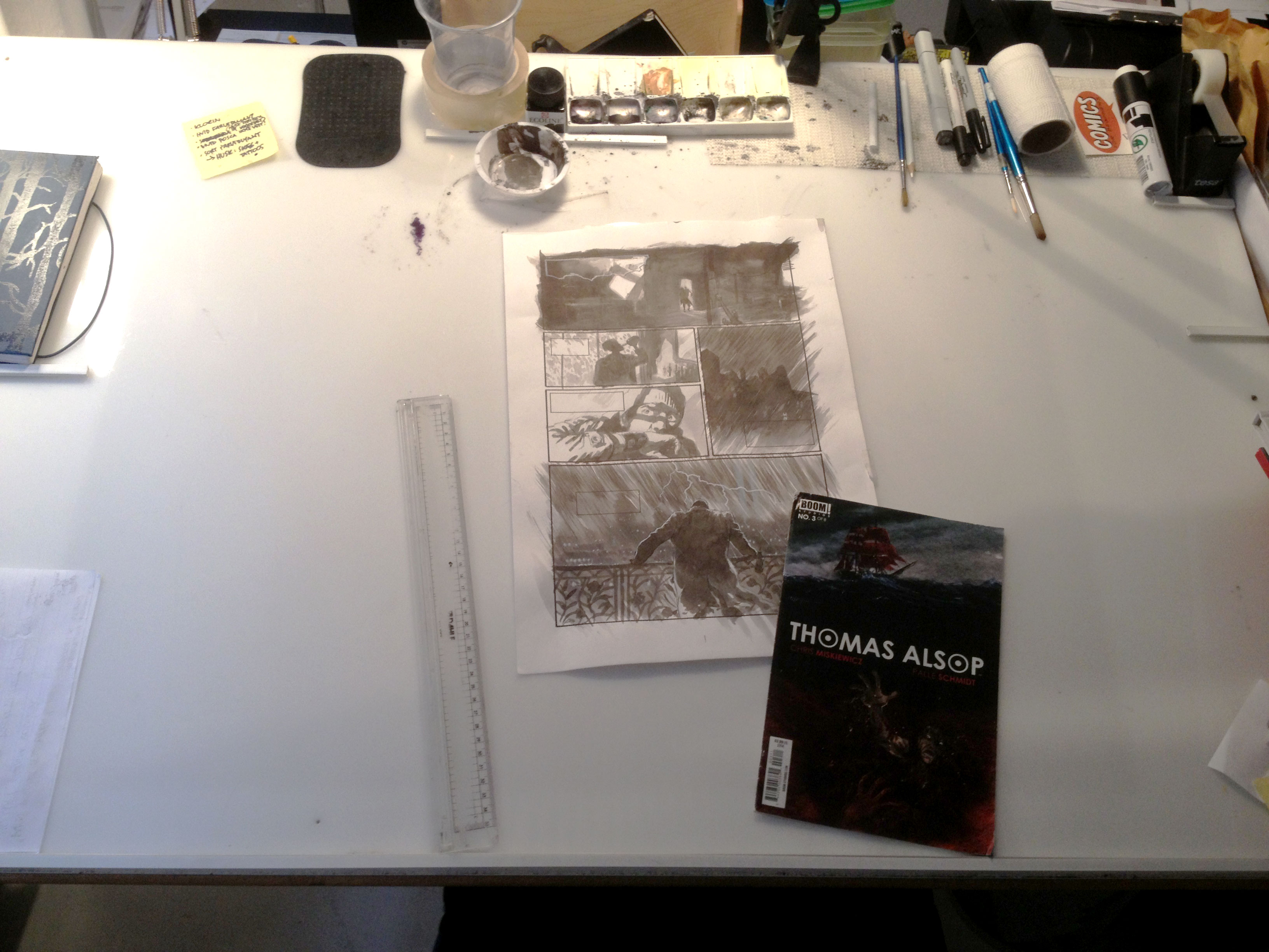
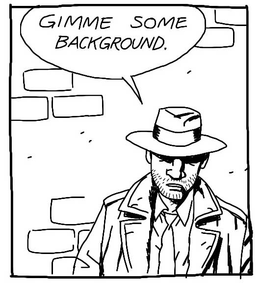
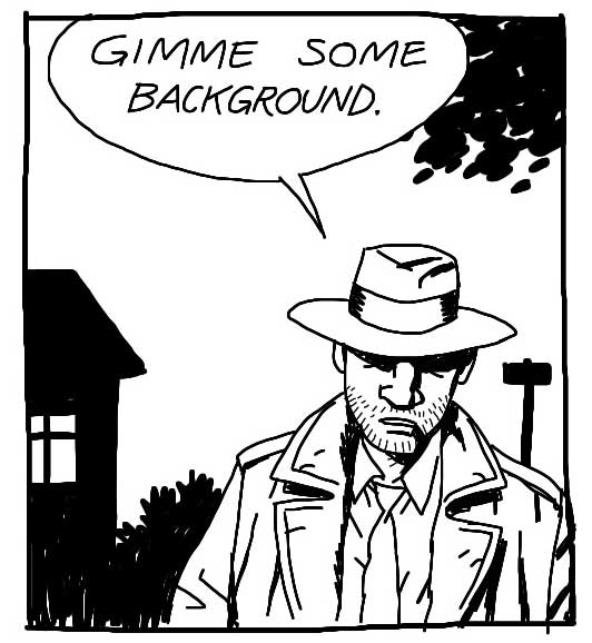
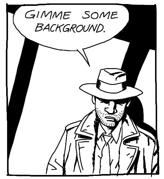
I got an email from a VIP subscriber who had a bunch of questions regarding his process. What program or software do you suggest for paneling or arranging the images with boarders on a computer? How much bigger should I do my drawing than the actual panel size? Is It important that all my drawings be consistent with that rule? Should I draw out panels into the page and start working on that or draw separate images and put them together on the computer?

I try to answer these and other questions in this podcast.

A shot of my desk, as requested by Joe!


Filed Under: Podcast, Pro Tips Tagged With: art hacks, artwork, creativity, drawing, how to, improving as an artist, inking, making comics, painted art, painting, Photoshop, pixelation, pro tips, process, scanning, test page, tips for making comics, workflow

Can Comics Composition Be Taught?

by Palle Schmidt 7 Comments

compositionIn any comic, the way the panels arranged on the page is extremely important. Equally important, is what’s inside the panels!

Every panel has it’s own composition. And the arranged panels make up the composition of the page.

It is almost impossible to teach composition. In comics, it’s basically the distribution of black (or dark) shapes on a white page. A good composition is pleasing to the eye and helps guide the reader’s attention. The main focus should be telling the story.

The best advice I can give on composition, is work really hard on your thumbnails. If it works in a two-three inch sketch, it will probably work in full size as well. Ask yourself if it’s clear what’s going on. Is the eye guided down the page? Is it pleasing to look at? Does the page “tip” because there is too much or too little black in some areas?

Another pitfall to avoid is vertical or horizontal lines within the frames, like a wall or a door. If the line art i.e. the thickness of the lines are similar, the eye can easily confuse it with the edge of the panel. If you make sure to break the lines within the panels with an object, a person or a speech ballon, and that will help the reader tell the lines apart.

Take photocopies of your thumbnails, and try going over them with a black marker, trying out different ways to apply shades and blocks of light, to make the page appealing. Remember that speech baloons are part of the picture! And if you intend to color the page that matters as well.

When you are working on the actual page, try tacking it to your wall and taking a few steps back. Quite a few steps, actually! If a panel or page works at a ten feet distance, you’ve done a good job.

If you’re working digitally, be sure to zoom out once in a while for the same effect. Or print it out and doodle on the printout to see what might help adjust the overall expression.

In summary: The more decisions you make at the thumbnail stage, the less trouble you will have with composition at the final inking stage.

—

Find tips like these helpful? Be sure to sign up for the newsletter

Filed Under: Pro Tips Tagged With: artwork, comic book layout, composition, drawing, drawing tips, how to, light and dark, making comics, page layout, panel layout, shading, thumbnails

Bonus Vid – Sketching a page of Thomas Alsop

by Palle Schmidt Leave a Comment

Another look into the my process as I sketch a page of Thomas Alsop (out now from BOOM! Studios).

For more on Thomas Alsop go to http://thomasalsop.com/.

Filed Under: Pro Tips, Video Tagged With: art hacks, artwork, Chris Miskiewicz, collaboration, comics, creativity, drawing, how to, making comics, mind hacks, mistakes, Palle Schmidt, planning, productivity, sketching, Thomas Alsop, tips for making comics, workflow, working methods

Art tutorial: 5 hacks for drawing backgrounds quicker

by Palle Schmidt 8 Comments

Do you have to draw backgrounds on every panel? The short answer is no. If you start with a good establishing shot and learn these 5 hacks, you can get away with very little background drawing!

1: Structure

If you place your characters against a wall or another big surface (like the sky!), a few rightly placed lines will give the illusion that we’re still in the place you showed us in the establishing shot (usually a wide shot in the first frame to establish the room or setting we are in, who is present, where the door is, stuff like that).structure-background

2: Silhouette

The outline of whatever is behind your characters can be quite enough – and a LOT quicker to draw! So if the scene takes place in a living room, just black out the shape of the lamp and a couch, if it takes place in the woods, black out tree trunks and leaves.

Pro tip: If you let elements poke in from the sides it lets us know there is more outside the frame. It’s a cheap trick but it works every time! Hint or show part of an object or shape and our minds will fill out the rest.

silhouette-background

3: Shadow

Some shadows – from a window, a tree or other objects nearby – is a great way of showing us what is outside the frame while avoiding to draw it all together. Don’t try to think realistically of where the light would be coming from or how the perspective would look, just treat it as a nice shape to liven up your drawing.

shadow-background

4: Gradient

A color gradient – or in this case just a grayscale one – can sometimes make it out for an actual background. It’s perhaps not the most sophisticated solution, but it makes the character “pop” and that’s often all you need.

gradient-background

5:  Riff

A “riff” is a graphic shortcut. Every artist has her own. Sometimes a riff is just some shapes/lines, not a realistic rendering of anything. Make your own riff or copy from another artist whose style resembles yours. I think I lifted this one from Mike Mignola, a brilliant background artist to steal from – because he rarely draws much and has a superb sense of graphic storytelling.

riff-background

Again, you need some background, at least in one or two frames per page, so the readers know where the characters are. But once you’ve established the world around your characters, it’s OK to cheat a little on the rest of the page. And now you know how!

—

If you want to know more about background drawing and perspective, check out this episode of the Comics for Beginners course.

Filed Under: Pro Tips Tagged With: art hacks, Art Tutorial, artwork, backgrounds, comics, drawing, how to, learning how to draw, making comics, pro tips, storytelling

  • « Go to Previous Page
  • Page 1
  • Page 2

Primary Sidebar

Hours of Premium Content

ComicsCrashCourse

Try the FREE 7-day Comics Course

Creator Profiles

Interviews with Creators

The CFB Podcasts

Find them here.

Comic Creators eBook

The Comic Creators eBook

Footer

Check out more resources

Bundles of quality content available, check how to write comics and how to make your comic book artwork look great or find tips and tricks on the blog.

Latest from the blog

  • Video: How to get Story Ideas
  • Video: The Benefit of Being a Nobody
  • Video: Why Creatives Hear Voices
  • Digital Tools for 2021
  • The Most Badass Tools for Inking Comics
  • Why Creative Restrictions are Good for You!
  • How to Write a Great Story – and Stick the Landing

Contact us

If you have questions or issues please contact us.

Official mail: mail(at)comicsforbeginners.com

Feel free to connect on Twitter and/or Facebook.

Copyright © 2026 · ComicsForBeginners by Palle Schmidt Log in