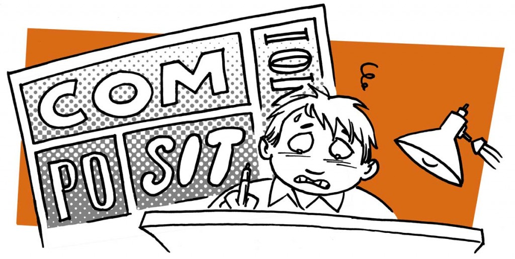
 In any comic, the way the panels arranged on the page is extremely important. Equally important, is what’s inside the panels!

Every panel has it’s own composition. And the arranged panels make up the composition of the page.
It is almost impossible to teach composition. In comics, it’s basically the distribution of black (or dark) shapes on a white page. A good composition is pleasing to the eye and helps guide the reader’s attention. The main focus should be telling the story.
The best advice I can give on composition, is work really hard on your thumbnails. If it works in a two-three inch sketch, it will probably work in full size as well. Ask yourself if it’s clear what’s going on. Is the eye guided down the page? Is it pleasing to look at? Does the page “tip” because there is too much or too little black in some areas?
Another pitfall to avoid is vertical or horizontal lines within the frames, like a wall or a door. If the line art i.e. the thickness of the lines are similar, the eye can easily confuse it with the edge of the panel. If you make sure to break the lines within the panels with an object, a person or a speech ballon, and that will help the reader tell the lines apart.
Take photocopies of your thumbnails, and try going over them with a black marker, trying out different ways to apply shades and blocks of light, to make the page appealing. Remember that speech baloons are part of the picture! And if you intend to color the page that matters as well.
When you are working on the actual page, try tacking it to your wall and taking a few steps back. Quite a few steps, actually! If a panel or page works at a ten feet distance, you’ve done a good job.
If you’re working digitally, be sure to zoom out once in a while for the same effect. Or print it out and doodle on the printout to see what might help adjust the overall expression.
In summary: The more decisions you make at the thumbnail stage, the less trouble you will have with composition at the final inking stage.
—
Find tips like these helpful? Be sure to sign up for the newsletter
I think a skill at doing this is to study what works in comics and print advertising. Ads (print advertising) are designed to move your eye across the page from left to right. Knowing how this is done can be a valuable tool in developing your panel creation.
I agree, John! Thanks for your insightful comment.
Really good advice on this one, thanks.
Much appreciated, Tammy!
I remember the section on composition in “How To Draw Comics the Marvel Way” – and not understanding one bit of it!
Apart from the reading order, I think composition comes down to intuition and looking at other art long enough to understand what works. It’s certainly not something you can learn from a blogpost..!
Teach Composition easy … ‘Basic Design’ Bauhaus style.. It starts like this, “Make a non-linear mark on a piece of paper [just that is a koan]; vary shapes of paper; vary number of marks….” Now look at groups of results and discuss. Six weeks of it in first year architecture degree did my head in, but I have never lost it – eventually you get to do it will several thousand buildings as part of a city…
Wow, Gary.. Did my head in just reading that description!
I went to archictecture school too, but I don’t remember being taught composition in any major way. It was basically learning by doing.
Thanks for this – actually explaining this in this way is extremely helpful, and it kinda gives the power back to the artist in a way that they really need to use their own experience and intuition and eye for themselves. I find using how something makes me FEEL when I look at it is a good way to discern things. Its like an artists individual style, you can’t teach that, its something that is learned through drawing, observing and experience.