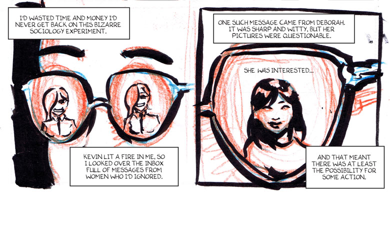
The grid. Is it keeping the artist from expressing himself or are guidelines helpful? Let’s talk about the pros and cons!
First let’s talk about what a “grid” is: The grid is the arrangement of panels on the page in a predictable and similar manner. For instance, sticking to three rows of panels per page or even having the same number of panels, like the popular 9-panel grid.
While you don’t have to follow the exact same grid on every page, it’s certainly helpful to have some sort of guidelines – especially if you want to experiment on some pages! Tilted panels, A panel with no frame or a double-page spread has little effect if ALL of the comic is experimental.
The upsides to following a grid are many. The hard part of the storytelling is already done for you, the reading order is obvious. But as long as readers can find their way from one panel to the next in the right order, there is lots of room for experimenting with the page layouts in comics. Just remember, characters and objects sticking out of panels, borderless panels or big, fancy page layouts can be a lot more challenging to read, let alone create!
Even if you have an overall grid you use for a particular project, breaking it up can be a good idea. Keep those readers awake! The use of larger panels for emphasis can be a good variation. Just be aware, that larger panels tend to slow things down and smaller panels give off a more hectic feel. You can also experiment with panels that bleed all the way to the edge of the page or perhaps a figure in a panel with no frame. Variation in size and borders can be done without deviating too far from the underlying grid – but it should always be rooted in the story, in what you are trying to get across.
You may feel like you should be coming up with new and exciting ways to tell your story, but deviating to far away from the grid requires a mastery of the craft and may in fact hurt the storytelling. If people have to stop and think about reading order or what is going on, you’re not doing your story any favors.
If you’re unsure of wether the page reads right, try drawing the balloons and panels on a seperate sheet, see if the reading order makes sense without any pictures. Sometimes you can fix any problems just by moving a balloon to the top or bottom of a panel, to make the reading order perfectly clear. No need to redraw the entire page because of it!
My advice: Experiment within the grid and steer clear of wild panel arrangements until you know how to tell a story in a simple layout. Have faith in your story and focus on telling that story. Don’t try to impress readers with flashy, cool page layouts if it makes for a confusing read. Communication is key.
