Do you have to draw backgrounds on every panel? The short answer is no. If you start with a good establishing shot and learn these 5 hacks, you can get away with very little background drawing!
1: Structure
If you place your characters against a wall or another big surface (like the sky!), a few rightly placed lines will give the illusion that we’re still in the place you showed us in the establishing shot (usually a wide shot in the first frame to establish the room or setting we are in, who is present, where the door is, stuff like that).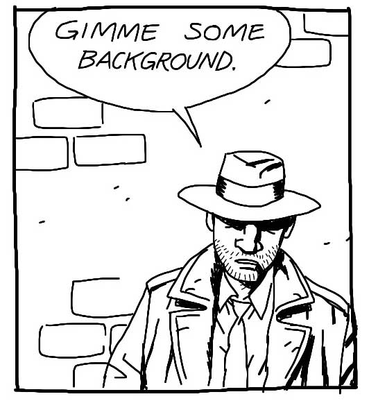
2: Silhouette
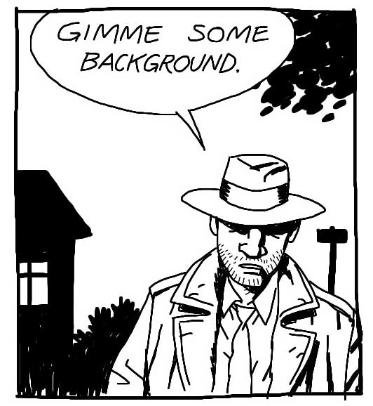
The outline of whatever is behind your characters can be quite enough – and a LOT quicker to draw! So if the scene takes place in a living room, just black out the shape of the lamp and a couch, if it takes place in the woods, black out tree trunks and leaves.
Pro tip: If you let elements poke in from the sides it lets us know there is more outside the frame. It’s a cheap trick but it works every time! Hint or show part of an object or shape and our minds will fill out the rest.
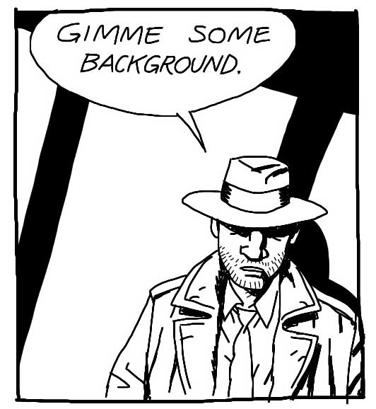
3: Shadow
Some shadows – from a window, a tree or other objects nearby – is a great way of showing us what is outside the frame while avoiding to draw it all together. Don’t try to think realistically of where the light would be coming from or how the perspective would look, just treat it as a nice shape to liven up your drawing.
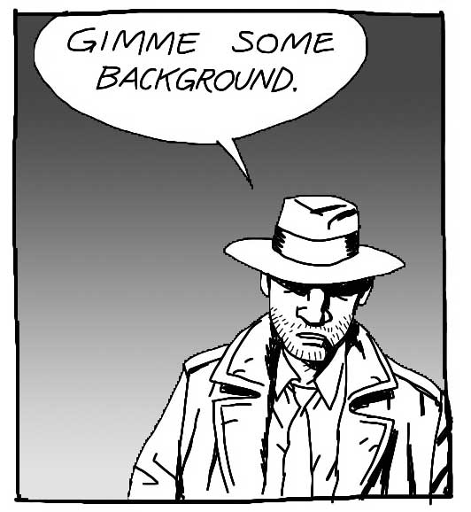
4: Gradient
A color gradient – or in this case just a grayscale one – can sometimes make it out for an actual background. It’s perhaps not the most sophisticated solution, but it makes the character “pop” and that’s often all you need.
5: Riff
A “riff” is a graphic shortcut. Every artist has her own. Sometimes a riff is just some shapes/lines, not a realistic rendering of anything. Make your own riff or copy from another artist whose style resembles yours. I think I lifted this one from Mike Mignola, a brilliant background artist to steal from – because he rarely draws much and has a superb sense of graphic storytelling.
Again, you need some background, at least in one or two frames per page, so the readers know where the characters are. But once you’ve established the world around your characters, it’s OK to cheat a little on the rest of the page. And now you know how!
—
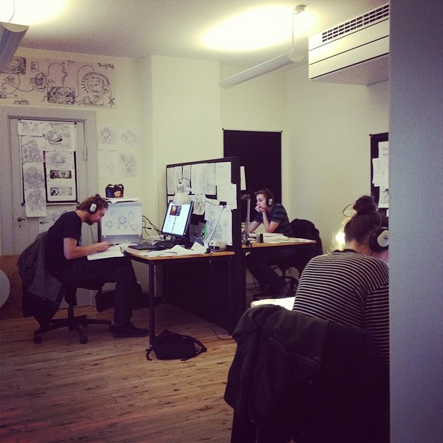
If you want to know more about background drawing and perspective, check out this episode of the Comics for Beginners course.
