Do your comics panels lie flat on the page? Struggle to make your characters more dynamic and your backgrounds more authentic? Here are 5 quick tips to making your comics come alive!
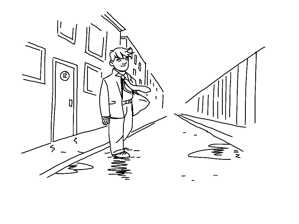
1. Wind
Yes, wind! We often forget the weather when we are making comics, but this is just another case of a little going a long way. A puddle or a snowdrift can give off the same effect and help us determine where and when we are.
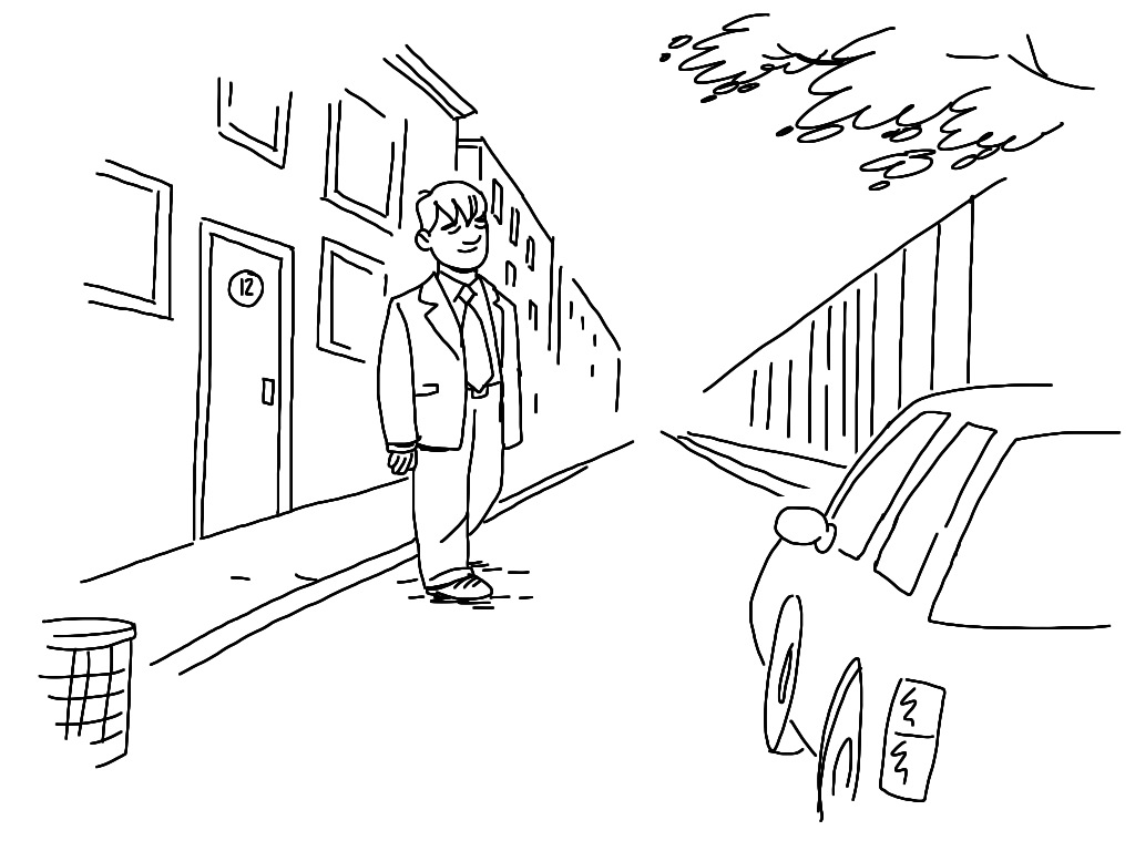
2. Foreground
Put something in the foreground of your frame will make it look like there is an actual world around your characters.
3. Shadows
Same as with foreground, the shade of something that is NOT visible in the frame, will give off the illusion of a bigger environment.
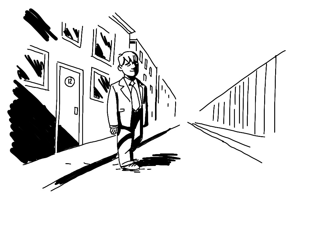
4. Tilt
If all your lines run parallel with the borders, you run risk of confusing and/or boring your reader. Tilt the image, make it seem more dynamic.
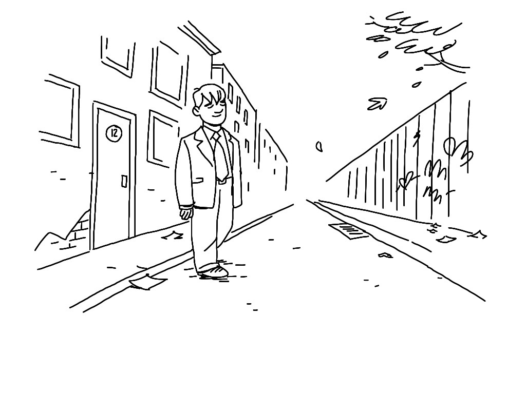
5. Trash
Put some paper scraps, dead leaves or cigarette butts in your frames to make them seem more lived in. A cracked pavement, a grafitti or some peeled paint gives the same feeling: The world exists outside this one, static image!
For more quick tips and art hacks like this, sign up to our newsletter!
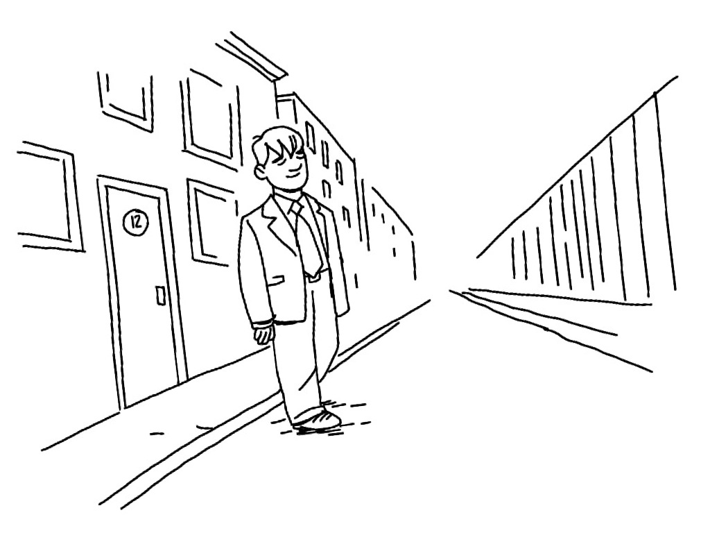
I think you should be more tilt the fourth picture.
Excellent tips thanks!