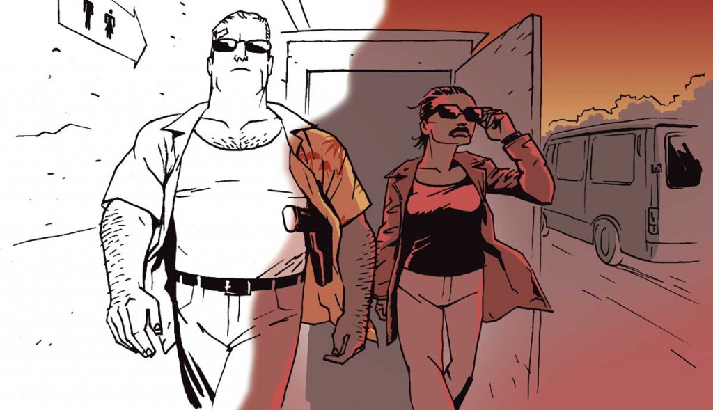
Coloring digitally in Photoshop or Manga Studio can save you some time and grief, and it is pretty easy to learn. Here are a few pro tips to make it even easier!
- Start with the background color and the general flow of the page and save the best for last: coloring your characters.
- Make a seperate layer for your characters and foreground objects, and flat them out first. This saves you time when coloring, because you can select the entire shape and not be afraid to paint outside the lines.
- If you are coloring for print, please note that your screen is backlit, which means it looks a lot brighter there than it will on paper! Beware of colors that are too dark.
- Convert the image to grayscale, to see if the color works. I know this sounds weird, but thinking of coloring in shades of grey can really help. It’s all about light and dark, and everything in between. By converting to grayscale, you will instantly spot where if it is all the same value, too dark or too muddled. You can always undo the conversion and get all your colors back!
- Always put your line art on top, so you paint under the line art. Set the line art layer mode to multiply, that should work perfectly.
- Colors should not compete with line art. Try not to have colors that are too dark. 80% black is probably too close to the black of the line art.
- Use a seperate layer for the background color and another on top for people and objects etc. Experiment with the opacity of your regular color layer, to let the background color shine through.
- Having a seperate layer for speech balloons and borders placed at the top of your color layers is also a good idea, as it prevents the risk of painting over your borders or into the whites of the balloons.
Related video:
Episode 8: Coloring in Photoshop

Leave a Reply
You must be logged in to post a comment.