Another look into the my process as I sketch a page of Thomas Alsop (out now from BOOM! Studios).
For more on Thomas Alsop go to http://thomasalsop.com/.
How to Write & Draw Comics
Another look into the my process as I sketch a page of Thomas Alsop (out now from BOOM! Studios).
For more on Thomas Alsop go to http://thomasalsop.com/.
1. Wind
Yes, wind! We often forget the weather when we are making comics, but this is just another case of a little going a long way. A puddle or a snowdrift can give off the same effect and help us determine where and when we are.
2. Foreground
Put something in the foreground of your frame will make it look like there is an actual world around your characters.
3. Shadows
Same as with foreground, the shade of something that is NOT visible in the frame, will give off the illusion of a bigger environment.

4. Tilt
If all your lines run parallel with the borders, you run risk of confusing and/or boring your reader. Tilt the image, make it seem more dynamic.
5. Trash
Put some paper scraps, dead leaves or cigarette butts in your frames to make them seem more lived in. A cracked pavement, a grafitti or some peeled paint gives the same feeling: The world exists outside this one, static image!
For more quick tips and art hacks like this, sign up to our newsletter!
The reason why these images just pop into my head on a very intuitive level is because I’ve put them there. Not on purpose, not by design. But by watching a whole lotta stuff over the years. Comics, painting, movies, real life – all of the things I’ve seen with my eyes, my brain remembers. All right, maybe not ALL the things I’ve seen. But you get the idea. The more you look at images, the more likely you are able to remember and replicate an image.
But again that’s not the whole truth.
Drawing these images vastly improves your ability to remember and replicate them. The more life drawing, the more copying you do, the more images you solidify in your subconsciousness.
The images that pop into my head probably do so, because I’ve seen them or drawn them before. Not that exact image, but something similar.
A few exercises:
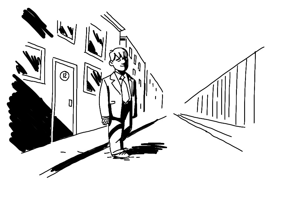
The image the Nigerian subscriber mentioned as a reference was this one.:
I can see why it looks seducingly easy, like I’m some comics genius. But I probably made half dozen versions of this image before landing on this one. At least in my head. That’s where the images usually come from, as I’m writing the script.
It’s not easy. But it get’s easier. The more images I see, the more images I draw, the more I have to replicate from.
And you know that feeling of having an image inside your head and not being able to get it down on paper? Yeah, I get that too. But I’ve learned to ignore it. The image in my head washes away and is replaced with whatever is on the page, and that’s OK. It’s just one drawing out of hundreds, thousands. I get less attached the more I draw. I feel like that’s the secret to making comics in some weird way. Not caring so much for the individual image but caring about the flow of the story.
Hope the longer answer is more helpful!
Related podcast: Drawing Every Day
A quick recommendation of three books to read for a better grasp on storytelling, structure and sequential art.
 Kevin Colden has written, drawn, colored, and lettered all sorts of comics over the last decade including Fishtown, I Rule the Night, Yours Truly Jack the Ripper (with writers Joe R. Lansdale and John L. Lansdale), and helped IDW Publishing relaunch James O’Barr’s The Crow in 2012 with writer John Shirley. His most recent work includes a digital one-shot adaptation of Robert Bloch’s Pumpkin with writer Steve Niles and colors for Dynamite’s GRIMM digital series, as well as his own upcoming series Ἀντιόχεια (Antioch). He lives in New York with his wife and their three-year-old son/personal assistant.
What made you decide to work in the medium of comics?
Comics have been a part of my life since I can remember, and until I was about twelve or thirteen years old, the only thing I wanted to do for a living when I grew up was write and draw comics. When I was a teenager I got very serious about music and theater, but I came back to comics when I decided not to pursue acting. My reasoning was that if I went to school for visual art I could always find work as a graphic designer if nothing else, but if I went to school for acting I would end up working as waiter or a clown at children’s birthday parties or something like that. I also hate auditioning, so I picked the fallback career that I liked more. As it turns out, that was a good idea, because it took me about eight years after graduating to be able to make any kind of living wage from comics. The reason why I picked comics as opposed to illustration, animation or design work probably comes from the fact that I like writing and telling stories as much as I like drawing. What I love most is when I’m able able to craft a complete piece of work from beginning to end and have people engage with it directly from me to them, with as little as possible in between. You can’t really do that with film or animation because there are so many other people involved. You can’t even do that with most comics if you want to make a living. So I guess it’s a little bit of an ego thing after having tried a few other disciplines that were more collaborative.
What part of the process is the most challenging or frustrating to you?
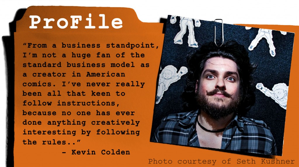
From a creative standpoint, I find the amount of time involved in drawing to be very frustrating. For a long time I was known as a guy who could do good work really fast, but that was mainly because I’m a little impatient, possibly a little ADHD. Nowadays I take a lot more time with the work, but it can be excruciating to realize that it’s taken me a month to do ten pages – until I realize that I’m doing full grayscale hatching and coloring it as well. Still it’s hard to accept that the reader is only going to spend a minute with a page that took three days to create. From a business standpoint, I’m not a huge fan of the standard business model as a creator in American comics. I’ve never really been all that keen to follow instructions, because no one has ever done anything creatively interesting by following the rules. I like to know those rules, for sure, but – as an example – if I’m making my own comic and need to promote it, where is the money coming from to go to six or seven conventions a year? Breaking even at a con is nearly impossible even if you’re very popular or are able to charge a lot for sketches. That’s not sound business to my eyes. So I prefer to find fun ways to work outside the system and then let everyone else run to where lightning just struck.
If you could give one piece of advice to an aspiring comics creator, what would that be?
Spend a lot of time trying different genres and styles, and when you find something you love and that you’re good at, focus on it. If you start hating it, start all over again.
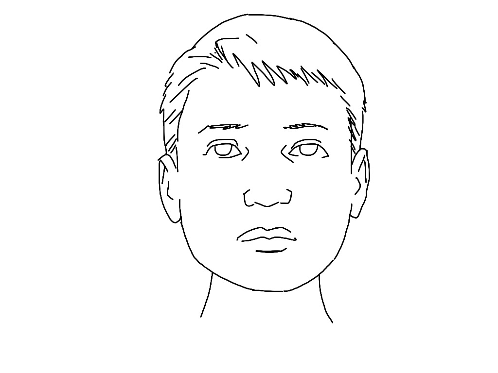
 Bland. That’s how I would describe this face. I obvouiusly drew it like that on purpose to make a point. But without really changing the expression of the character, I can easily make it more interesting to look at, by adding some dramatic shadows.
The safest way to apply shadow, is under all the features of the face that extrude – The chin, the nose, the eyebrows (and in this case, the hair).
Effect: If applied lightly, like shown here, not much. But it DOES make the drawing quicker to read, as the main features stand out.
Pitfalls: Shading under eyes and chinbones can make characters look very old/bony.
Oooh, spooky! Who hasn’t held a flashlight under their chin to look like this?
Effect: Dramatic, fearful, scary.
Pitfalls: That shadow on the upper lip could easily look like a moustache. Handle with care.
Another great dramatic shading technique, allowing you to hide facial details = less to draw!
Effect: Makes the character look menacing and/or makes the reader uneasy, because the expression is unreadable.
Pitfalls: Too much black, and you can’t recognize the character. Too little, and it will look like a smear right down the middle of the face.
One of the most used ways of shading is the light from one side. It also helps reader navigation, like if you cut between two characters talking – one would be lit from the left, the other from the right.
Effect: I guess you could go Freudian, and imply split personality, but… In reality, it just looks cool.
Pitfalls: Too sharp lines between the light and dark side will make it look like the person put on half a cowl. Put some dark areas on the light side of the face and blend the lines: Problem solved.
Almost the same as above, only with a second light source, to make the face seem three-dimensional and add to the atmosphere.
Effect: Makes it look like you are the best artist in the world! Seriously!
Pitfalls: It’s tricky to tackle both light sources at once, so draw the primary shadow first and then apply the secondary light source in highlights after the fact. Here I added a little more dark to widen the distance between the light sources. It’s also a good idea to make one highlight sharp and the lines on the other more fuzzy.
Homework assignment: Print out a bunch of copies of the shadowless, bland face and test your newly achieved skills!
—
Hey, if you liked these tips, you’re gonna LOVE our newsletter. Sign up now and get more tutorials and bonus content!
If you have questions or issues please contact us.
Official mail: mail(at)comicsforbeginners.com